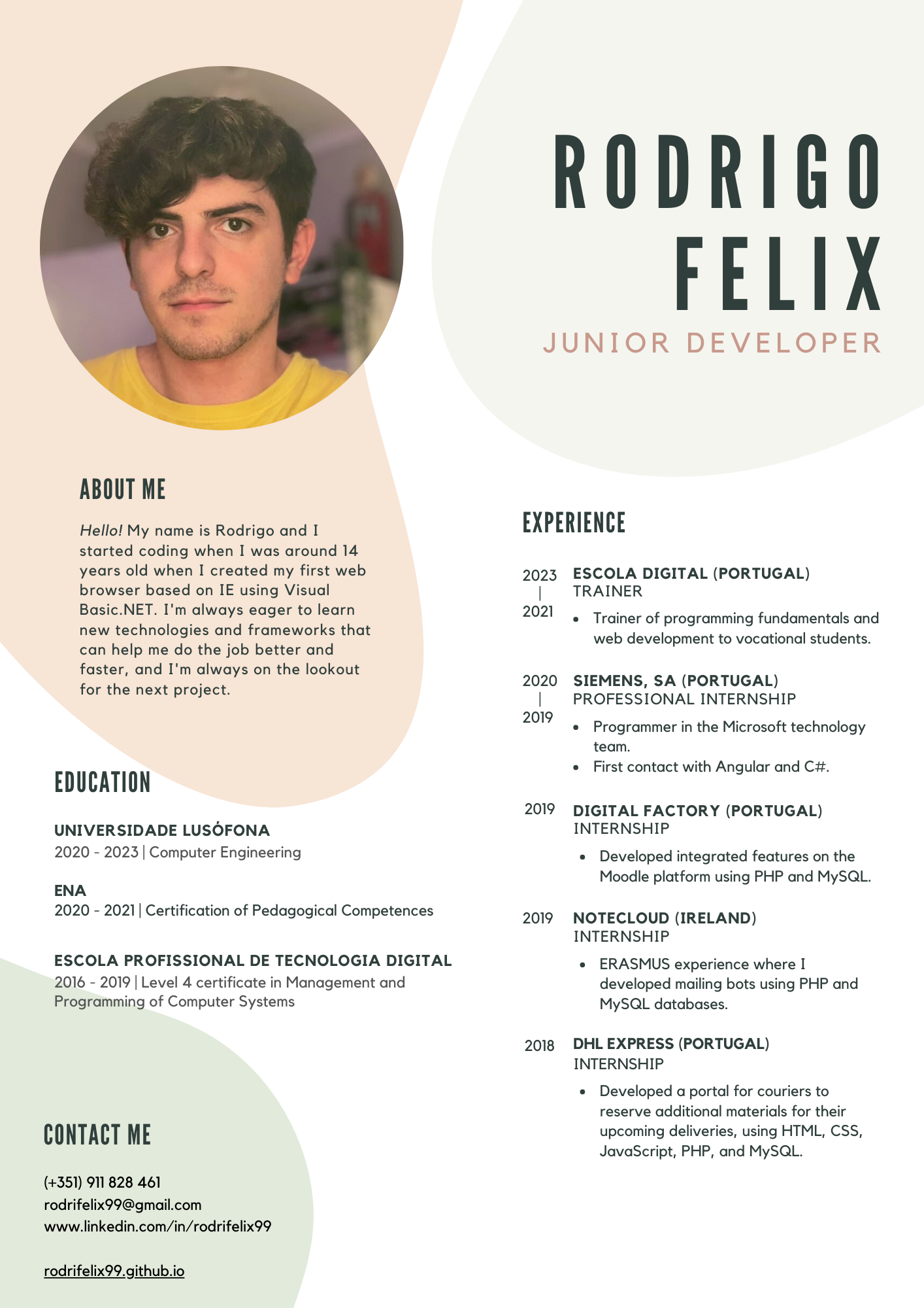
Hi, I'm Felix
I'm a Junior web and software developer
I'm a Junior web and software developer

My skills
About me

Hi! I'm Felix and I started developing when I was about
14 and created my very first IE based
web browser using Visual Basic .NET
around that time.
I'm always eager to
learn new technologies and
frameworks that can help get the job
done well and fast, and I'm always
looking for the next project.
I happily worked with these guys


My personal projects
 Under development
Hoot
Under development
Hoot

Created with Flutter.
Hoot is an innovative social networking platform that introduces a unique concept of multiple feeds. Unlike traditional social networks, Hoot empowers its users to categorize their posts by creating multiple personalized feeds. This enables users to curate and organize their content based on specific interests, topics, or communities.
One of the key features of Hoot is the ability for users to create and manage their own distinct feeds, which other users can subscribe to. This allows for a more tailored and personalized social media experience, as individuals can choose to follow specific feeds that align with their preferences and areas of interest.
By offering the flexibility to create multiple feeds, Hoot fosters a diverse and engaging environment where users can connect with like-minded individuals and discover content that is most relevant to them. Whether it's a feed dedicated to hobbies, professional interests, or specific communities, Hoot provides a platform for users to explore and engage with a variety of content streams.
Currently in internal testing.
 Live
Live
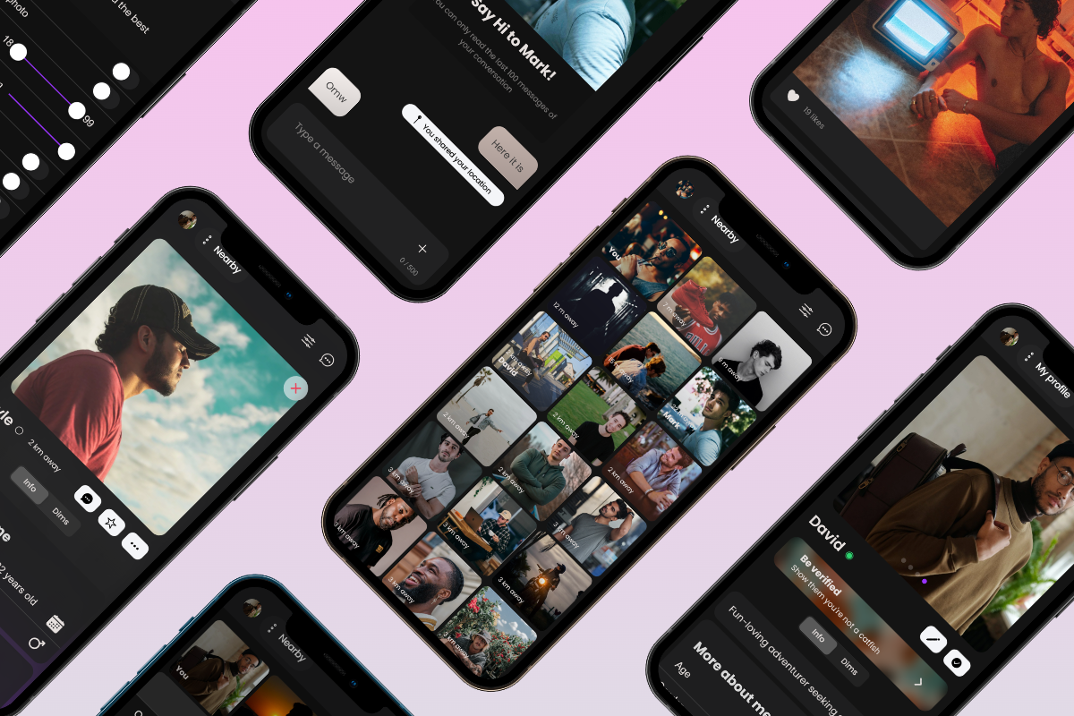
Dimmed
Live
Dimmed
Created with IONIC and Angular.
Dimmed is an innovative mobile app designed specifically for the LGBTQ+ community. It is the ultimate dating app that combines cutting-edge features to provide users with an exceptional dating experience.
With Dimmed, you can easily discover and connect with like-minded individuals nearby in a visually appealing grid format. Whether you're looking for meaningful relationships or casual encounters, Dimmed offers a safe and private environment for you to explore your options.
One of the standout features of Dimmed is its advanced Matchmaker. The Matchmaker analyzes your interests, values, and desires to connect you with compatible users. This personalized approach enhances your chances of finding meaningful connections and sparks genuine conversations.
Dimmed prioritizes user safety and authenticity. With the Verification feature, you can ensure that you're interacting with real individuals, helping to avoid catfishing and fostering a trustworthy community. Moreover, the app's Safety Center provides valuable resources, advice, and support to ensure a secure and positive experience for all users.
Dimmed offers a comprehensive set of filters to help you find the perfect match. Additionally, the app allows you to share your thoughts and experiences with the world through Dims, which are posts visible to users in your vicinity.
 Live
Live
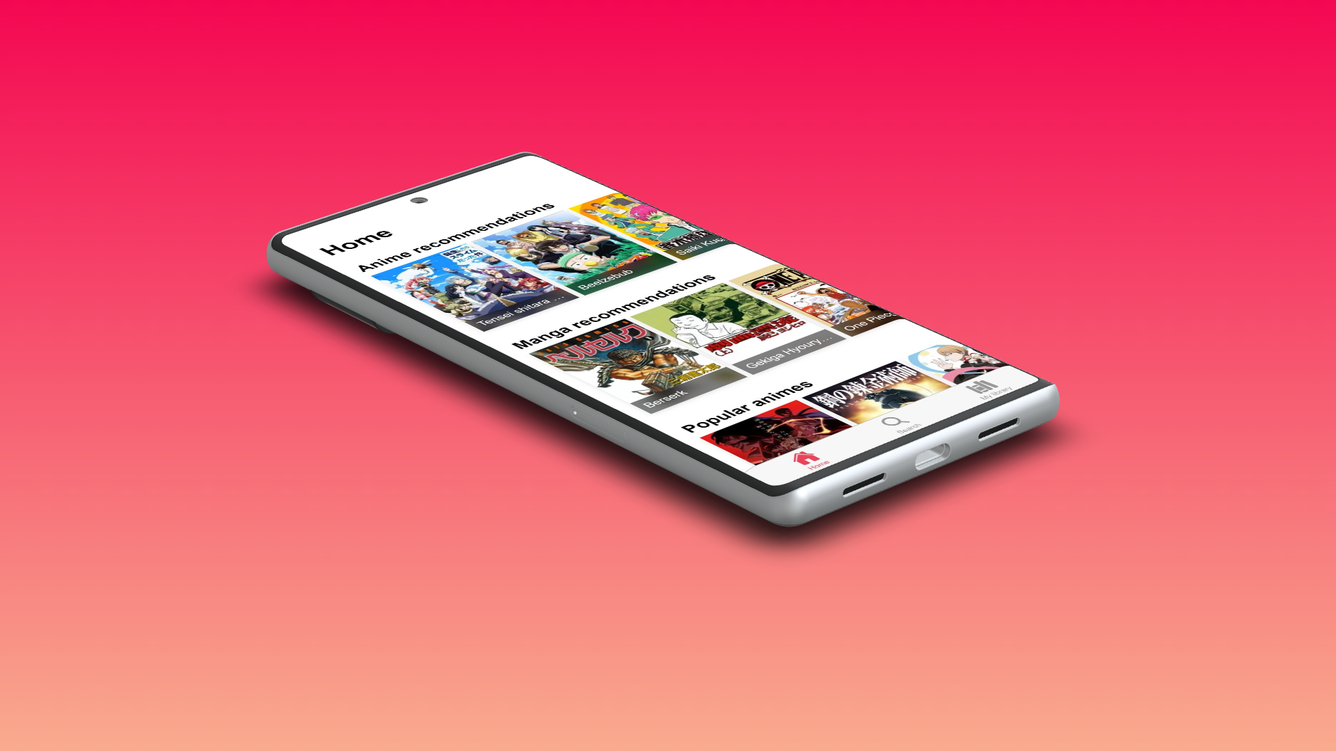
Otaku
Live
Otaku
Created with IONIC and Angular.
Otaku is a serverless app that allows you to keep track of your favorite anime and manga, and also discover new ones.
Otaku is feeded by the MyAnimeList API, and it doesn't require any kind of registration or login.
It keeps all your information stored locally, so you can use it offline.
You can keep track where you left off, and also see the next episode release date.
You can also check which episodes are fillers, and which ones are canon.
 Requires mainentance
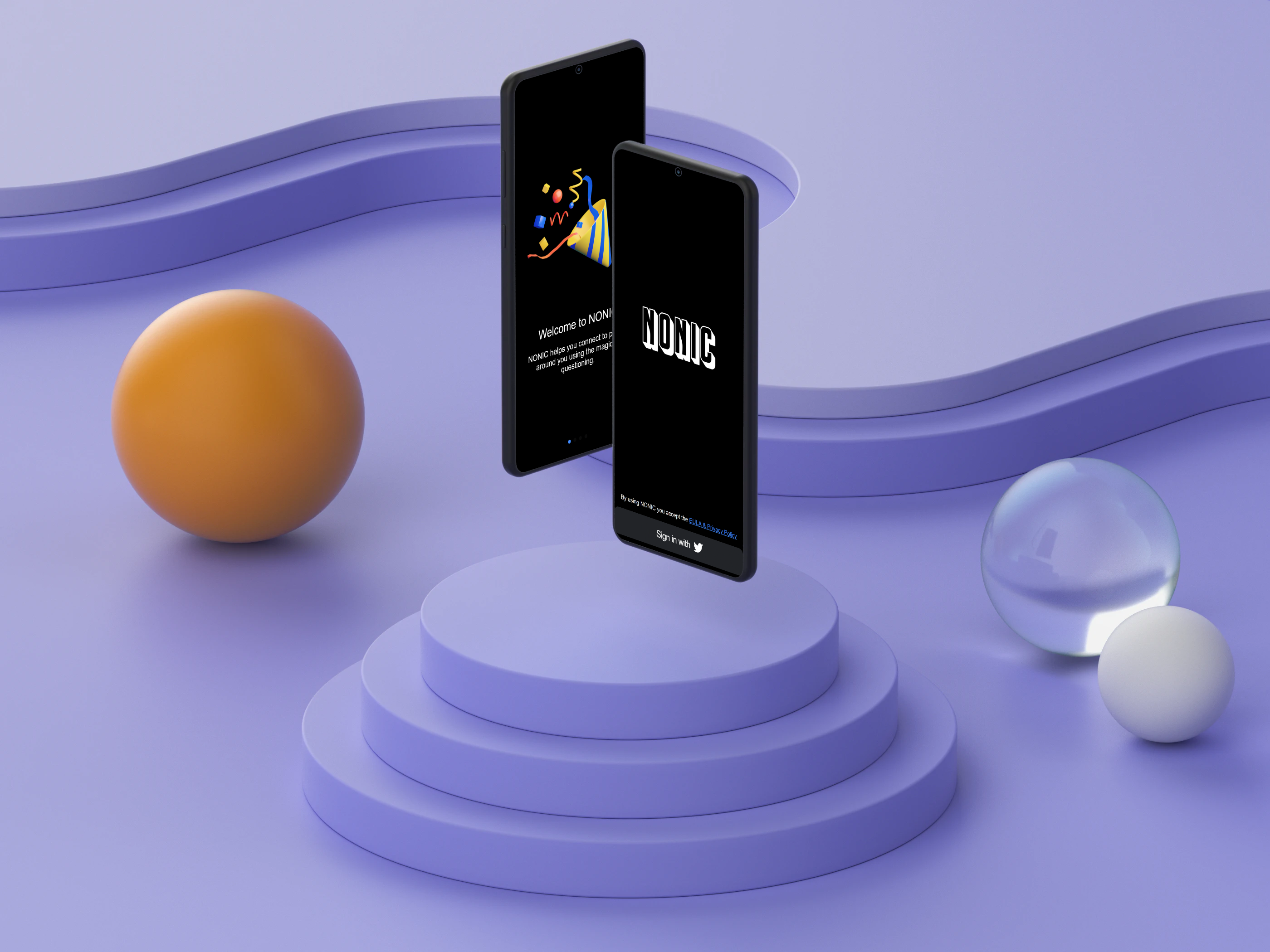
NONIC
Requires mainentance
NONIC
Created with IONIC and Angular.
What is NONIC?
NONIC is an Android and iOS app that helps you connect to people around you using the magic of
questioning.
Question & answer
Ask questions to people you love or are interested in. You can choose to ask publicly or
anonymously.
Have fun
We filter the questions people ask you so you only have to worry about answering the most
relevant
questions.
 Available for community forks
Skyvee
Archived
Check
it on
GitHub
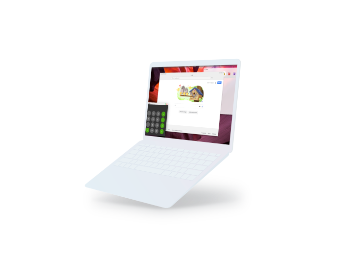
Skyvee

Created with Electron.
A lightweight virtual desktop that is based on web apps. Nowadays every app has its own
web app
version that cuts processing and space needs by more than half! With the power of Skyvee, the
user will have the best experience possible with a computer incredibly cheap, but always good
looking.
Skyvee is written on JavaScript, it means every app added to the SkyApp Store can be created
using
the most versatile language in the world! Skyvee will also run any web app as a completely
native
app giving the user a perfect experience possible. There is no blue screen, no freezes, no
lagging,
and most importantly, free support forever.
Watch a video here.
 Archived
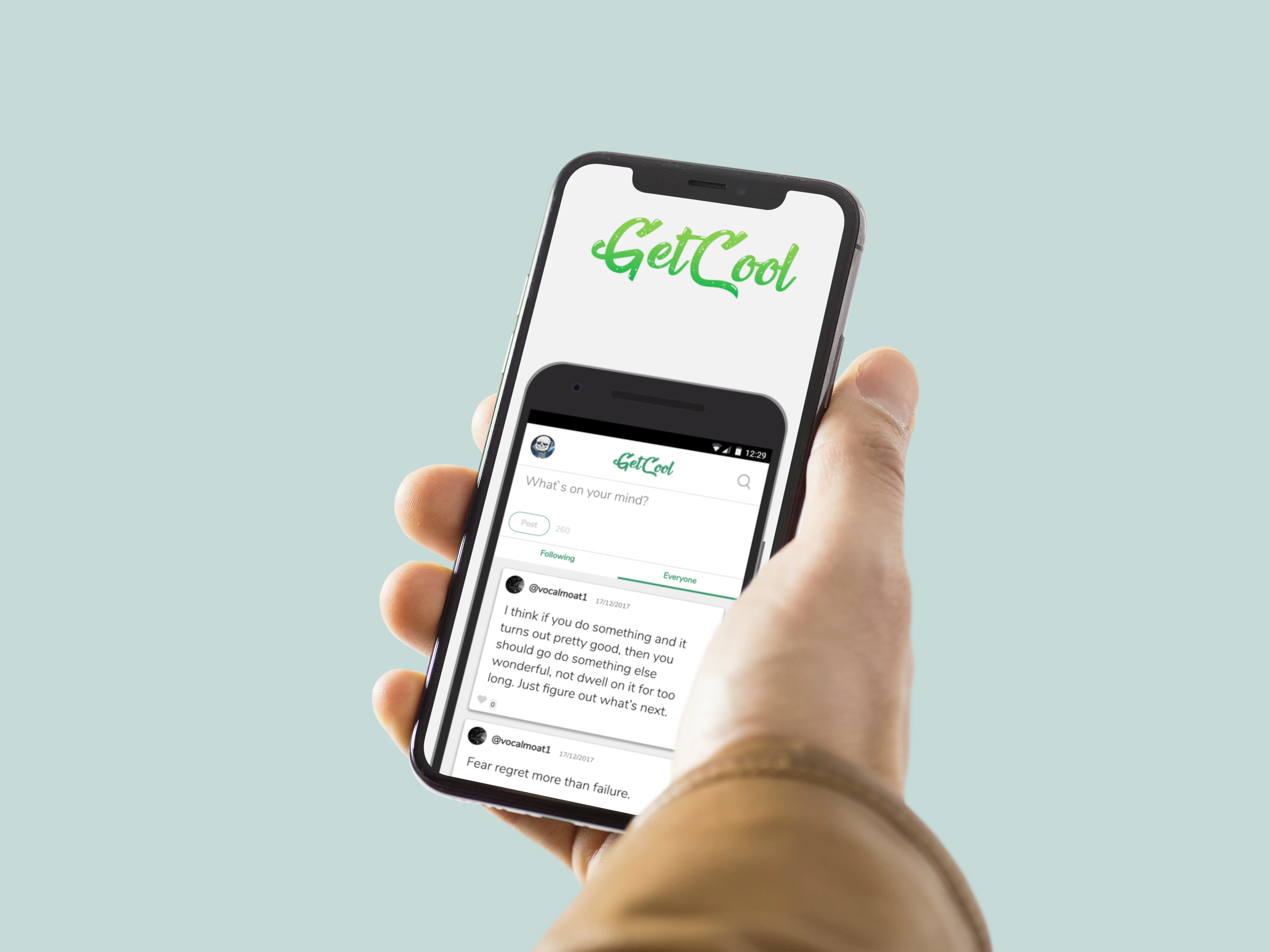
GetCool
Archived
GetCool

Created with HTML, CSS, JavaScript, PHP and MySQL.
GetCool was a mobile webapp where people could sign up for free and share their thoughts without
names or pictures.
 Archived
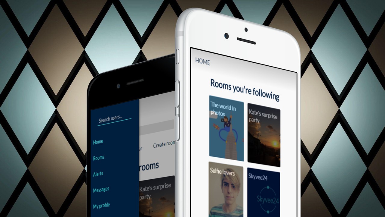
Skyvee24
Archived
Skyvee24
Created with HTML, CSS, JavaScript, PHP and MySQL.
Social network that combines interests with virtual rooms. Makes it easier to bring people
together.
 Archived
Buddy
Archived
Buddy
Created with HTML, CSS, JavaScript, PHP and MySQL.
Network that connects people from different cultures to show the best of both sides.

This website
Get in touch


<!DOCTYPE html>
<html lang="en">
<head>
<meta charset="UTF-8">
<meta http-equiv="X-UA-Compatible" content="IE=edge">
<meta name="viewport" content="width=device-width, initial-scale=1.0">
<title>Rodrigo Felix</title>
<link rel="icon" type="image/png" href="favicon.png" />
<link rel="stylesheet" type="text/css" href="style.css">
<script src="https://cdn.jsdelivr.net/npm/page-flip/dist/js/page-flip.browser.min.js"></script>
<script src="./rellax.min.js"></script>
<script src="./jquery.js"></script>
</head>
<body>
<div id="header">
<div class="bg"></div>
<div class="bg bg2"></div>
<div class="bg bg3"></div>
<div id="particle-container">
<div class="particle"></div>
<div class="particle"></div>
<div class="particle"></div>
<div class="particle"></div>
<div class="particle"></div>
<div class="particle"></div>
<div class="particle"></div>
<div class="particle"></div>
<div class="particle"></div>
<div class="particle"></div>
<div class="particle"></div>
<div class="particle"></div>
<div class="particle"></div>
<div class="particle"></div>
<div class="particle"></div>
<div class="particle"></div>
<div class="particle"></div>
<div class="particle"></div>
<div class="particle"></div>
<div class="particle"></div>
<div class="particle"></div>
<div class="particle"></div>
<div class="particle"></div>
<div class="particle"></div>
<div class="particle"></div>
<div class="particle"></div>
<div class="particle"></div>
<div class="particle"></div>
<div class="particle"></div>
<div class="particle"></div>
</div>
<div class="content">
<div class="img-container">
<img class="cv" src="img/cv.png" />
</div>
<div class="rellax side-text" data-rellax-speed="-5">
<h1>Hi, I'm Felix</h1>
<p>I'm a <b>Junior</b> web and software developer</p>
</div>
</div>
</div>
<img class="wave-divider" src="img/wave.png">
<div class="two">
<p class="title" style="margin-top: 0px;">My skills</p>
<div class="skill-bars">
<div class="bar">
<div class="info">
<span>Will to learn</span>
</div>
<div class="progress-line wtl">
<span></span>
</div>
</div>
<div class="bar">
<div class="info">
<span>HTML</span>
</div>
<div class="progress-line html">
<span></span>
</div>
</div>
<div class="bar">
<div class="info">
<span>CSS</span>
</div>
<div class="progress-line css">
<span></span>
</div>
</div>
<div class="bar">
<div class="info">
<span>jQuery</span>
</div>
<div class="progress-line jquery">
<span></span>
</div>
</div>
<div class="bar">
<div class="info">
<span>PHP</span>
</div>
<div class="progress-line php">
<span></span>
</div>
</div>
<div class="bar">
<div class="info">
<span>MySQL</span>
</div>
<div class="progress-line mysql">
<span></span>
</div>
</div>
<div class="bar">
<div class="info">
<span>Java</span>
</div>
<div class="progress-line java">
<span></span>
</div>
</div>
<div class="bar">
<div class="info">
<span>C#</span>
</div>
<div class="progress-line csharp">
<span></span>
</div>
</div>
<div class="bar">
<div class="info">
<span>Angular 2+</span>
</div>
<div class="progress-line angular">
<span></span>
</div>
</div>
</div>
<div class="aboutMe">
<p class="title">About me</p>
<img src="img/me.jpg" />
<p class="text">
Hi! I'm Felix and I was born in '99. I
started developing when I was about
14 and created my very first IE based
web browser using Visual Basic .NET
around that time.<br />I'm always eager to
learn new technologies and
frameworks that can help get the job
done well and fast, and I'm always
looking for the next project.
</p>
</div>
<p class="title">I happily worked with these guys</p>
<div class="brands">
<img class="brand" src="img/siemens.png" onclick="window.location.href = 'https://www.siemens.com/'" />
<img class="brand" src="img/dhl.png" onclick="window.location.href = 'https://www.dhl.com/'" />
<img class="brand" src="img/notecloud.jpg" onclick="window.location.href = 'https://www.zinmobi.com/'" />
<img class="brand" src="img/digitalFactory.png"
onclick="window.location.href = 'https://www.digitalfactory.pt/'" />
</div>
</div>
<img class="wave-divider-upside-down" src="img/wave.png">
<div class="three">
<p class="title" style="margin-bottom: 50px; margin-top: 15vh;">My personal projects</p>
<div class="dark-bg"></div>
<div class="card rellax2" data-rellax-speed="1" onclick="cardToggle('nonic')">
<img src="img/nonic.png" />
<span class="label">In development</span>
<p class="card-title">NONIC</p>
</div>
<div class="card-over nonic">
<div class="outer" onclick="cardToggle('nonic')">
<div class="inner">
<label>Back</label>
</div>
</div>
<img src="img/nonic.png" />
<span class="label">In development</span>
<div class="explaining">
<p class="card-title">NONIC</p>
<img class="platform apple" src="img/apple.png" />
<img class="platform android" src="img/android.png" />
<p class="text">
<b>What is NONIC?</b><br />
NONIC is an Android and iOS app that helps you connect to people around you using the magic of
questioning.<br />
<br />
<b>Question & answer</b>
Ask questions to people you love or are interested in. You can choose to ask publicly or
anonymously.<br />
<br />
<b>Have fun</b>
We filter the questions people ask you so you only have to worry about answering the most relevant
questions.
<br /><br />
Due to release this summer for Android and iOS devices.
</p>
</div>
</div>
<div class="card rellax2" data-rellax-speed="2" onclick="cardToggle('skyvee')">
<img src="img/skyvee/card.png" />
<span class="label">Finished project</span>
<p class="card-title">Skyvee</p>
</div>
<div class="card-over skyvee">
<div class="outer" onclick="cardToggle('skyvee')">
<div class="inner">
<label>Back</label>
</div>
</div>
<img src="img/skyvee/card.png" />
<span class="label">Finished project</span>
<span class="label github"
onclick="window.location.href = 'https://github.com/rodrifelix99/SkyveeOS'">Check it on GitHub</span>
<div class="explaining">
<p class="card-title">Skyvee</p>
<img class="platform apple" src="img/apple.png" />
<img class="platform android" src="img/windows.png" />
<img class="platform linux" src="img/linux.png" />
<p class="text">
<b>A lightweight virtual desktop that is based on web apps.</b> Nowadays every app has its own web app
version that cuts processing and space needs by more than half! With the power of Skyvee, the
user will have the best experience possible with a computer incredibly cheap, but always good
looking.<br />
Skyvee is written on JavaScript, it means every app added to the SkyApp Store can be created using
the most versatile language in the world! Skyvee will also run any web app as a completely native
app giving the user a perfect experience possible. There is no blue screen, no freezes, no lagging,
and most importantly, free support forever.
<br /><br />
Watch a video <a href="https://www.youtube.com/watch?v=uFSNx8keQhM&ab_channel=Skyvee">here</a>.
</p>
</div>
</div>
<div class="card rellax2" data-rellax-speed="2" onclick="cardToggle('getcool')">
<img src="img/getcool.png" />
<span class="label">Finished project</span>
<p class="card-title">GetCool</p>
</div>
<div class="card-over getcool">
<div class="outer" onclick="cardToggle('getcool')">
<div class="inner">
<label>Back</label>
</div>
</div>
<img src="img/getcool.png" />
<span class="label">Finished project</span>
<div class="explaining">
<p class="card-title">GetCool</p>
<img class="platform apple" src="img/apple.png" />
<img class="platform android" src="img/android.png" />
<img class="platform linux" src="img/web.png" />
<p class="text">
GetCool was a mobile webapp where people could sign up for free and share their thoughts without
names or pictures.
</p>
</div>
</div>
<div class="card rellax2" data-rellax-speed="2" onclick="cardToggle('skyvee24')">
<img src="img/skyvee24.jpg" />
<span class="label">Finished project</span>
<p class="card-title">Skyvee24</p>
</div>
<div class="card-over skyvee24">
<div class="outer" onclick="cardToggle('skyvee24')">
<div class="inner">
<label>Back</label>
</div>
</div>
<img src="img/skyvee24.jpg" />
<span class="label">Finished project</span>
<div class="explaining">
<p class="card-title">Skyvee24</p>
<img class="platform apple" src="img/apple.png" />
<img class="platform android" src="img/android.png" />
<img class="platform linux" src="img/web.png" />
<p class="text">
Social network that combines interests with virtual rooms. Makes it easier to bring people together.
</p>
</div>
</div>
<div class="card rellax2" data-rellax-speed="2" onclick="cardToggle('buddy')">
<img src="img/buddy.png" />
<span class="label">Finished project</span>
<p class="card-title">Buddy</p>
</div>
<div class="card-over buddy">
<div class="outer" onclick="cardToggle('buddy')">
<div class="inner">
<label>Back</label>
</div>
</div>
<img src="img/buddy.png" />
<span class="label">Finished project</span>
<div class="explaining">
<p class="card-title">Buddy</p>
<img class="platform apple" src="img/apple.png" />
<img class="platform android" src="img/android.png" />
<img class="platform linux" src="img/web.png" />
<p class="text">
Network that connects people from different cultures to show the best of both sides.
</p>
</div>
</div>
</div>
<img class="wave-divider" src="img/wave.png">
<p class="title" style="margin-top: 0px;">Get in touch</p>
<div class="contacts">
<img title="E-mail" src="img/email.png"
onclick="window.open('mailto:rodrifelix99@gmail.com?subject=Just saw your portfolio!&body=Hi Felix, I just saw your portfolio. May we chat for a bit?');" />
<img title="LinkedIn" src="img/linkedin.png"
onclick="window.location.href = 'https://www.linkedin.com/in/rodrifelix99/'" />
<img title="Whatsapp" src="img/whatsapp.png"
onclick="window.location.href = 'whatsapp://send?abid=+351911828461&text=Hi%2C%Felix!'" />
<img title="Instagram" src="img/instagram.png"
onclick="window.location.href = 'https://www.instagram.com/rodrifelix99/'" />
</div>
<div class="page">
<!-- YOU ARE HERE :) -->
</div>
<script>
function cardToggle(className) {
$(".dark-bg").toggle();
$("." + className).toggle();
setTimeout(() => {
$("." + className).css("height", "80vh");
}, 500);
}
var rellax = new Rellax('.rellax');
var rellax = new Rellax('.rellax2', {
wrapper: '.three'
});
$(".cv").click(() => {
$(".cv").toggleClass("open");
$(".dark-bg").toggle();
});
$('#book').scroll(function () {
if ($('#book').scrollTop() > 500) {
$(".progress-line").addClass("progress-line-active");
}
});
</script>
</body>
</html>
@import url('https://fonts.googleapis.com/css2?family=Poppins:wght@100;400;700&display=swap');
* {
font-family: 'Poppins', sans-serif;
overflow-x: hidden;
margin: 0;
text-rendering: optimizeLegibility;
font-smooth: always;
-webkit-font-smoothing: antialiased;
-moz-osx-font-smoothing: grayscale;
color: #333333;
transition: all .2s ease-in-out !important;
outline: none;
}
*::-webkit-scrollbar {
width: 10px;
/* width of the entire scrollbar */
}
*::-webkit-scrollbar-track {
background-color: rgba(255, 215, 177, 0.247);
backdrop-filter: blur(5px);
/* color of the tracking area */
}
*::-webkit-scrollbar-thumb {
background-color: rgba(77, 64, 52, 0.247);
backdrop-filter: blur(5px);
/* color of the scroll thumb */
border-radius: 20px;
/* roundness of the scroll thumb */
}
div {
overflow-y: hidden;
}
#header {
display: block;
background: #F4E4D5;
height: 110vh;
}
.particle {
position: absolute;
border-radius: 50%;
}
@keyframes particle-animation-1 {
100% {
transform: translate3d(45vw, 17vh, 51px);
}
}
.particle:nth-child(1) {
animation: particle-animation-1 60s infinite;
opacity: 0.06;
height: 9px;
width: 9px;
animation-delay: -0.2s;
transform: translate3d(71vw, 15vh, 7px);
background: #3ed926;
}
@keyframes particle-animation-2 {
100% {
transform: translate3d(56vw, 48vh, 14px);
}
}
.particle:nth-child(2) {
animation: particle-animation-2 60s infinite;
opacity: 0.26;
height: 8px;
width: 8px;
animation-delay: -0.4s;
transform: translate3d(6vw, 75vh, 28px);
background: #d92691;
}
@keyframes particle-animation-3 {
100% {
transform: translate3d(5vw, 31vh, 45px);
}
}
.particle:nth-child(3) {
animation: particle-animation-3 60s infinite;
opacity: 0.84;
height: 8px;
width: 8px;
animation-delay: -0.6s;
transform: translate3d(42vw, 62vh, 16px);
background: #26bbd9;
}
@keyframes particle-animation-4 {
100% {
transform: translate3d(4vw, 45vh, 55px);
}
}
.particle:nth-child(4) {
animation: particle-animation-4 60s infinite;
opacity: 0.32;
height: 7px;
width: 7px;
animation-delay: -0.8s;
transform: translate3d(85vw, 36vh, 14px);
background: #94d926;
}
@keyframes particle-animation-5 {
100% {
transform: translate3d(8vw, 23vh, 82px);
}
}
.particle:nth-child(5) {
animation: particle-animation-5 60s infinite;
opacity: 0.29;
height: 10px;
width: 10px;
animation-delay: -1s;
transform: translate3d(29vw, 56vh, 46px);
background: #d99726;
}
@keyframes particle-animation-6 {
100% {
transform: translate3d(85vw, 72vh, 29px);
}
}
.particle:nth-child(6) {
animation: particle-animation-6 60s infinite;
opacity: 0.44;
height: 7px;
width: 7px;
animation-delay: -1.2s;
transform: translate3d(2vw, 57vh, 43px);
background: #6526d9;
}
@keyframes particle-animation-7 {
100% {
transform: translate3d(68vw, 14vh, 77px);
}
}
.particle:nth-child(7) {
animation: particle-animation-7 60s infinite;
opacity: 0.48;
height: 9px;
width: 9px;
animation-delay: -1.4s;
transform: translate3d(28vw, 22vh, 29px);
background: #4dd926;
}
@keyframes particle-animation-8 {
100% {
transform: translate3d(25vw, 33vh, 5px);
}
}
.particle:nth-child(8) {
animation: particle-animation-8 60s infinite;
opacity: 0.03;
height: 7px;
width: 7px;
animation-delay: -1.6s;
transform: translate3d(11vw, 73vh, 83px);
background: #d98826;
}
@keyframes particle-animation-9 {
100% {
transform: translate3d(13vw, 1vh, 93px);
}
}
.particle:nth-child(9) {
animation: particle-animation-9 60s infinite;
opacity: 0.09;
height: 7px;
width: 7px;
animation-delay: -1.8s;
transform: translate3d(12vw, 8vh, 39px);
background: #d97126;
}
@keyframes particle-animation-10 {
100% {
transform: translate3d(79vw, 26vh, 72px);
}
}
.particle:nth-child(10) {
animation: particle-animation-10 60s infinite;
opacity: 0.49;
height: 7px;
width: 7px;
animation-delay: -2s;
transform: translate3d(45vw, 35vh, 49px);
background: #d95f26;
}
@keyframes particle-animation-11 {
100% {
transform: translate3d(45vw, 72vh, 43px);
}
}
.particle:nth-child(11) {
animation: particle-animation-11 60s infinite;
opacity: 0.71;
height: 6px;
width: 6px;
animation-delay: -2.2s;
transform: translate3d(26vw, 61vh, 63px);
background: #26d9cd;
}
@keyframes particle-animation-12 {
100% {
transform: translate3d(17vw, 22vh, 18px);
}
}
.particle:nth-child(12) {
animation: particle-animation-12 60s infinite;
opacity: 0.81;
height: 10px;
width: 10px;
animation-delay: -2.4s;
transform: translate3d(29vw, 41vh, 69px);
background: #26d971;
}
@keyframes particle-animation-13 {
100% {
transform: translate3d(28vw, 90vh, 57px);
}
}
.particle:nth-child(13) {
animation: particle-animation-13 60s infinite;
opacity: 0.19;
height: 7px;
width: 7px;
animation-delay: -2.6s;
transform: translate3d(32vw, 43vh, 100px);
background: #26d9c7;
}
@keyframes particle-animation-14 {
100% {
transform: translate3d(87vw, 2vh, 24px);
}
}
.particle:nth-child(14) {
animation: particle-animation-14 60s infinite;
opacity: 0.66;
height: 6px;
width: 6px;
animation-delay: -2.8s;
transform: translate3d(66vw, 41vh, 93px);
background: #26d980;
}
@keyframes particle-animation-15 {
100% {
transform: translate3d(46vw, 51vh, 64px);
}
}
.particle:nth-child(15) {
animation: particle-animation-15 60s infinite;
opacity: 0.48;
height: 8px;
width: 8px;
animation-delay: -3s;
transform: translate3d(48vw, 44vh, 77px);
background: #3b26d9;
}
@keyframes particle-animation-16 {
100% {
transform: translate3d(29vw, 77vh, 21px);
}
}
.particle:nth-child(16) {
animation: particle-animation-16 60s infinite;
opacity: 0.96;
height: 6px;
width: 6px;
animation-delay: -3.2s;
transform: translate3d(77vw, 58vh, 57px);
background: #d95f26;
}
@keyframes particle-animation-17 {
100% {
transform: translate3d(43vw, 7vh, 96px);
}
}
.particle:nth-child(17) {
animation: particle-animation-17 60s infinite;
opacity: 0.66;
height: 6px;
width: 6px;
animation-delay: -3.4s;
transform: translate3d(4vw, 38vh, 56px);
background: #d99126;
}
@keyframes particle-animation-18 {
100% {
transform: translate3d(75vw, 58vh, 20px);
}
}
.particle:nth-child(18) {
animation: particle-animation-18 60s infinite;
opacity: 0.15;
height: 9px;
width: 9px;
animation-delay: -3.6s;
transform: translate3d(4vw, 24vh, 67px);
background: #d92644;
}
@keyframes particle-animation-19 {
100% {
transform: translate3d(80vw, 62vh, 58px);
}
}
.particle:nth-child(19) {
animation: particle-animation-19 60s infinite;
opacity: 0.3;
height: 10px;
width: 10px;
animation-delay: -3.8s;
transform: translate3d(7vw, 48vh, 71px);
background: #26d982;
}
@keyframes particle-animation-20 {
100% {
transform: translate3d(68vw, 31vh, 96px);
}
}
.particle:nth-child(20) {
animation: particle-animation-20 60s infinite;
opacity: 0.65;
height: 7px;
width: 7px;
animation-delay: -4s;
transform: translate3d(72vw, 15vh, 84px);
background: #26d93e;
}
@keyframes particle-animation-21 {
100% {
transform: translate3d(47vw, 78vh, 80px);
}
}
.particle:nth-child(21) {
animation: particle-animation-21 60s infinite;
opacity: 0.09;
height: 9px;
width: 9px;
animation-delay: -4.2s;
transform: translate3d(61vw, 50vh, 75px);
background: #26d994;
}
@keyframes particle-animation-22 {
100% {
transform: translate3d(66vw, 81vh, 42px);
}
}
.particle:nth-child(22) {
animation: particle-animation-22 60s infinite;
opacity: 0.84;
height: 6px;
width: 6px;
animation-delay: -4.4s;
transform: translate3d(30vw, 82vh, 21px);
background: #26d94d;
}
@keyframes particle-animation-23 {
100% {
transform: translate3d(9vw, 65vh, 36px);
}
}
.particle:nth-child(23) {
animation: particle-animation-23 60s infinite;
opacity: 0.59;
height: 6px;
width: 6px;
animation-delay: -4.6s;
transform: translate3d(38vw, 62vh, 52px);
background: #a6d926;
}
@keyframes particle-animation-24 {
100% {
transform: translate3d(88vw, 64vh, 66px);
}
}
.particle:nth-child(24) {
animation: particle-animation-24 60s infinite;
opacity: 0.72;
height: 8px;
width: 8px;
animation-delay: -4.8s;
transform: translate3d(72vw, 21vh, 88px);
background: #26d944;
}
@keyframes particle-animation-25 {
100% {
transform: translate3d(4vw, 48vh, 88px);
}
}
.particle:nth-child(25) {
animation: particle-animation-25 60s infinite;
opacity: 0.27;
height: 6px;
width: 6px;
animation-delay: -5s;
transform: translate3d(7vw, 19vh, 98px);
background: #266bd9;
}
@keyframes particle-animation-26 {
100% {
transform: translate3d(75vw, 4vh, 67px);
}
}
.particle:nth-child(26) {
animation: particle-animation-26 60s infinite;
opacity: 0.07;
height: 8px;
width: 8px;
animation-delay: -5.2s;
transform: translate3d(16vw, 40vh, 67px);
background: #d92c26;
}
@keyframes particle-animation-27 {
100% {
transform: translate3d(5vw, 33vh, 91px);
}
}
.particle:nth-child(27) {
animation: particle-animation-27 60s infinite;
opacity: 0.58;
height: 8px;
width: 8px;
animation-delay: -5.4s;
transform: translate3d(55vw, 81vh, 100px);
background: #35d926;
}
@keyframes particle-animation-28 {
100% {
transform: translate3d(88vw, 86vh, 44px);
}
}
.particle:nth-child(28) {
animation: particle-animation-28 60s infinite;
opacity: 0.7;
height: 9px;
width: 9px;
animation-delay: -5.6s;
transform: translate3d(79vw, 43vh, 13px);
background: #26d994;
}
@keyframes particle-animation-29 {
100% {
transform: translate3d(56vw, 47vh, 81px);
}
}
.particle:nth-child(29) {
animation: particle-animation-29 60s infinite;
opacity: 0.49;
height: 6px;
width: 6px;
animation-delay: -5.8s;
transform: translate3d(44vw, 42vh, 10px);
background: #26d9b8;
}
@keyframes particle-animation-30 {
100% {
transform: translate3d(74vw, 35vh, 54px);
}
}
.particle:nth-child(30) {
animation: particle-animation-30 60s infinite;
opacity: 0.15;
height: 10px;
width: 10px;
animation-delay: -6s;
transform: translate3d(11vw, 65vh, 71px);
background: #d92629;
}
#header .content {
display: block;
margin: auto;
width: 80%;
padding-bottom: 45px;
}
#header .img-container {
display: inline-block;
vertical-align: top;
height: 75vh;
margin-top: 20vh;
width: 40%;
overflow-y: hidden;
}
#header img {
z-index: 999;
height: 50vh;
margin-top: 5vh;
margin-left: 20%;
box-shadow: 0 4px 8px 0 rgba(0, 0, 0, 0.2), 0 6px 20px 0 rgba(0, 0, 0, 0.19);
transform: rotate(-10deg) !important;
cursor: pointer;
}
#header img.open {
display: none;
transform: rotate(0deg) !important;
max-width: 80%;
height: auto;
box-shadow: 0 19px 38px rgba(0, 0, 0, 0.30), 0 15px 12px rgba(0, 0, 0, 0.22);
position: absolute !important;
top: 0 !important;
margin-top: 4vh;
margin-left: 0%;
border-radius: 20px;
display: block;
}
#header .side-text {
display: inline-block;
vertical-align: top;
margin-top: 35vh;
}
#header .side-text h1 {
font-size: 28pt;
}
#header .side-text p {
text-transform: uppercase;
font-size: 16pt;
}
img.wave-divider {
width: 100%;
margin-top: -10vh;
}
img.wave-divider-upside-down {
width: 100%;
transform: rotate(180deg);
}
div.two {
width: 100%;
}
p.title {
font-size: 28pt;
font-weight: bold;
text-align: center;
margin-top: 100px;
}
.skill-bars {
display: block;
margin: auto;
margin-top: 50px;
width: 90%;
max-width: 700px;
}
.skill-bars .bar {
margin: 20px 0;
}
.skill-bars .bar:first-child {
margin-top: 0px;
}
.skill-bars .bar .info {
margin-bottom: 5px;
}
.skill-bars .bar .info span {
font-weight: 500;
font-size: 17px;
opacity: 0;
animation: showText 0.5s 1s linear forwards;
}
@keyframes showText {
100% {
opacity: 1;
}
}
.skill-bars .bar .progress-line {
height: 10px;
width: 100%;
background: #f0f0f0;
position: relative;
transform: scaleX(0);
transform-origin: left;
border-radius: 10px;
box-shadow: inset 0 1px 1px rgba(0, 0, 0, 0.05),
0 1px rgba(255, 255, 255, 0.8);
}
.bar .progress-line-active {
animation: animate 1s cubic-bezier(1, 0, 0.5, 1) forwards;
}
@keyframes animate {
100% {
transform: scaleX(1);
}
}
.bar .progress-line span {
height: 100%;
position: absolute;
border-radius: 10px;
transform: scaleX(0);
transform-origin: left;
background: #d1c1b2;
}
.bar .progress-line-active span {
animation: animate 1s 1s cubic-bezier(1, 0, 0.5, 1) forwards;
}
.bar .progress-line.wtl span {
width: 100%;
}
.bar .progress-line.html span {
width: 95%;
}
.bar .progress-line.css span {
width: 80%;
}
.bar .progress-line.jquery span {
width: 70%;
}
.bar .progress-line.php span {
width: 70%;
}
.bar .progress-line.mysql span {
width: 75%;
}
.bar .progress-line.java span {
width: 50%;
}
.bar .progress-line.csharp span {
width: 50%;
}
.bar .progress-line.angular span {
width: 60%;
}
.progress-line span::before {
position: absolute;
content: "";
top: -10px;
right: 0;
height: 0;
width: 0;
border: 7px solid transparent;
border-bottom-width: 0px;
border-right-width: 0px;
border-top-color: #000;
opacity: 0;
animation: showText2 0.5s 1.5s linear forwards;
}
.progress-line span::after {
position: absolute;
top: -28px;
right: 0;
font-weight: 500;
background: #000;
color: #fff;
padding: 1px 8px;
font-size: 12px;
border-radius: 3px;
opacity: 0;
animation: showText2 0.5s 1.5s linear forwards;
}
@keyframes showText2 {
100% {
opacity: 1;
}
}
div.two .brands {
display: block;
margin-top: 50px;
width: 100%;
text-align: center;
}
img.brand {
display: inline-block;
vertical-align: top;
margin: 0px 5%;
height: 50px;
cursor: pointer;
}
div.three {
display: block;
margin: auto;
margin-top: -10vh;
background-color: #F4E4D5;
text-align: center;
padding-bottom: 15vh;
}
div.dark-bg {
display: none;
position: fixed;
top: 0;
left: 0;
right: 0;
bottom: 0;
background-color: rgba(173, 146, 120, 0.247);
backdrop-filter: blur(5px);
z-index: 998;
}
div.three div.card {
display: inline-block;
vertical-align: top;
margin: 10px 20px;
background-color: #FFFFFF;
border-radius: 20px;
-webkit-box-shadow: 0px 1px 1px 1px rgba(0, 0, 0, 0.15);
-moz-box-shadow: 0px 1px 1px 1px rgba(0, 0, 0, 0.15);
box-shadow: 0px 1px 1px 1px rgba(0, 0, 0, 0.15);
width: 90%;
max-width: 450px;
cursor: pointer;
}
div.three div.card:hover {
box-shadow:
0 2.8px 2.2px rgba(0, 0, 0, 0.034),
0 6.7px 5.3px rgba(0, 0, 0, 0.048),
0 12.5px 10px rgba(0, 0, 0, 0.06),
0 22.3px 17.9px rgba(0, 0, 0, 0.072),
0 41.8px 33.4px rgba(0, 0, 0, 0.086),
0 100px 80px rgba(0, 0, 0, 0.12);
}
div.three div.card img {
width: 100%;
height: 250px;
object-fit: cover;
object-position: top center;
}
div.three div.card span.label {
position: relative;
float: right;
padding: 3px 7px;
font-size: 10pt;
text-transform: uppercase;
background-color: rgba(255, 215, 177, 0.247);
backdrop-filter: blur(5px);
border-radius: 5px;
margin: -45px 10px;
}
div.three div.card p.card-title {
display: block;
margin: auto;
margin-top: 10px;
margin-bottom: 15px;
width: 90%;
font-size: 18pt;
font-weight: bold;
text-align: left;
}
div.card-over {
display: none;
position: fixed;
top: 10vh;
left: 50%;
transform: translate(-50%, 0);
height: 0vh;
background-color: #FFFFFF;
border-radius: 20px;
box-shadow:
0 2.8px 2.2px rgba(0, 0, 0, 0.034),
0 6.7px 5.3px rgba(0, 0, 0, 0.048),
0 12.5px 10px rgba(0, 0, 0, 0.06),
0 22.3px 17.9px rgba(0, 0, 0, 0.072),
0 41.8px 33.4px rgba(0, 0, 0, 0.086),
0 100px 80px rgba(0, 0, 0, 0.12);
width: 90%;
max-width: 600px;
z-index: 999;
}
div.card-over img {
width: 100%;
height: 50vh;
object-fit: cover;
object-position: center;
}
div.card-over span.label {
position: relative;
float: right;
padding: 3px 7px;
font-size: 10pt;
text-transform: uppercase;
background-color: rgba(255, 215, 177, 0.247);
backdrop-filter: blur(5px);
border-radius: 5px;
margin: -45px 10px;
}
div.card-over span.github {
float: left;
margin: -45px 10px;
color: #FFF;
background-color: rgba(0, 0, 0, 0.459);
cursor: pointer;
}
div.card-over div.explaining {
display: block;
margin: auto;
height: 30vh;
overflow-y: auto;
}
div.explaining p.card-title {
display: block;
margin: auto;
margin: 10px auto;
width: 90%;
font-size: 18pt;
font-weight: bold;
text-align: left;
}
div.card-over img.platform {
float: right;
margin-top: -40px;
width: 20px;
height: 20px;
object-fit: contain;
opacity: 0.8;
}
div.card-over img.apple {
margin-right: 10px;
}
div.card-over img.android {
margin-right: 40px;
}
div.card-over img.linux {
margin-right: 70px;
}
div.card-over div.explaining p.text {
font-size: 11pt;
text-align: justify;
padding: 0px 5%;
padding-bottom: 30px;
}
div.card-over .outer {
position: absolute;
top: 10px;
right: 10px;
margin: auto;
width: 50px;
cursor: pointer;
}
.inner {
width: inherit;
text-align: center;
}
label {
font-size: .8em;
line-height: 4em;
text-transform: uppercase;
color: #fff;
transition: all .3s ease-in;
opacity: 0;
background-color: rgba(85, 70, 55, 0.452);
backdrop-filter: blur(5px);
padding: 3px;
border-radius: 5px;
cursor: pointer;
}
.inner:before,
.inner:after {
position: absolute;
content: '';
height: 1px;
width: inherit;
background-color: rgba(85, 70, 55, 0.452);
backdrop-filter: blur(5px);
left: 0;
transition: all .3s ease-in;
}
.inner:before {
top: 50%;
transform: rotate(45deg);
}
.inner:after {
bottom: 50%;
transform: rotate(-45deg);
}
.outer:hover label {
opacity: 1;
}
.outer:hover .inner:before,
.outer:hover .inner:after {
transform: rotate(0);
}
.outer:hover .inner:before {
top: 0;
}
.outer:hover .inner:after {
bottom: 0;
}
div.contacts {
display: block;
margin: auto;
width: 100%;
text-align: center;
padding: 100px 0px;
}
div.contacts img {
display: inline-block;
vertical-align: top;
margin: auto 5%;
width: 30px;
height: 30px;
object-fit: contain;
cursor: pointer;
}
.aboutMe {
display: block;
margin: auto;
text-align: center;
}
.aboutMe p.title {
margin-bottom: 30px;
}
.aboutMe img {
display: inline-block;
vertical-align: top;
max-width: 40%;
max-height: 400px;
border-radius: 10px;
margin-right: 5%;
margin-bottom: 30px;
animation-name: floating;
animation-duration: 3s;
animation-iteration-count: infinite;
animation-timing-function: ease-in-out;
}
.aboutMe .text {
display: inline-block;
vertical-align: top;
text-align: justify;
width: 40%;
max-width: 500px;
margin-left: 5%;
margin-top: 100px;
}
@keyframes floating {
0% {
transform: translate(0, 0px);
}
30% {
transform: translate(0, 15px);
transform: rotate(-2deg);
}
70% {
transform: translate(0, 15px);
transform: rotate(2deg);
}
100% {
transform: translate(0, -0px);
}
}
div.page {
position: absolute;
top: 0;
bottom: 0;
left: 0;
width: 100%;
color: #FFF;
background-color: rgba(0, 0, 0, 0.671);
overflow-y: auto;
}
div.page code{
color: #FFF;
}
@media only screen and (max-width: 1440px) {
#header .img-container {
display: block;
margin: auto;
height: auto;
margin-top: 5vh;
width: 100%;
overflow-y: hidden;
}
#header img {
display: block;
margin: auto;
margin-top: 5vh;
margin-bottom: 5vh;
}
#header .side-text {
display: block;
margin: auto;
margin-top: 0px;
}
}
@media only screen and (max-width: 600px) {
.aboutMe img {
display: block;
margin: auto;
max-width: 90%;
max-height: 400px;
border-radius: 10px;
margin-bottom: 30px;
animation-name: floating;
animation-duration: 3s;
animation-iteration-count: infinite;
animation-timing-function: ease-in-out;
}
.aboutMe .text {
display: block;
margin: auto;
text-align: justify;
width: 90%;
max-width: 500px;
margin-top: 0px;
}
.wave-divider-upside-down {
display: none;
}
img.brand {
margin: 10px;
}
div.three {
margin-top: 100px;
}
div.three p.title{
margin-top: 50px !important;
}
}